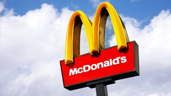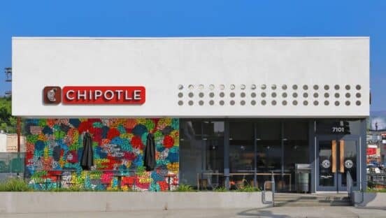
The medium is indeed the message, regarding the relationship between a quick-service restaurant and its logo. From the nighttime glow of the Golden Arches, a beacon atop a flagpole, illuminating a starless sky and a darkened roadway—from the stylized shape of the letter “M” to the less luminescent icons of the interstate, including a five-pointed crown of orange and red, a logo says everything without saying a word. And yet, too many quick-service restaurants have logos that say nothing.
If you doubt my assertion, then do me the favor of describing or drawing the logos for Applebee’s and IHOP. (This is a random selection on my part, but proof of a larger point: If your logo is an apple, and your company is not Apple, how do you equal or exceed the influence of an image that represents a trillion-dollar corporation and one of the most beloved brands in history? IHOP, in contrast, has a familiar name but not a famous logo).
My complaint concerns the separation between style and substance, meaning marketers need to go beyond analyzing and applying consumer data. They need to condense or convert what they interpret into a symbol that conveys what their patrons know and believe: that the emphasis is on a signature meal or an overall experience, or both, where what people see they simultaneously feel.
According to graphic designers at the Parsons School of Design and the Chief Design Officer at DesignMantic, the “logo challenge” is not exclusive to quick-service dining. It is, however, endemic throughout this industry, save the arches and crowns outside many a drive-thru window.
Consider, too, the opinion of Wayne R. Cohen, a professor of law at George Washington University and a partner at Cohen & Cohen, P.C. He says: “Business planning is as much an exercise in compliance as it is a study in compelling content. One is a legal requirement, while the other seems like it is optional. Both are in fact a necessity”
The problem seems to be one of grandiose dreams versus generic designs. That is, it is hard to glorify a business of slight degrees of difference between itself and the competition. Harder still is the attempt to transform a lackluster brand into a banner (or a ribbon or a wave) of dynamism, as if a logo is the cause rather than the effect of a company’s success.
The secret sauce, so to speak, is a logo that wins hearts and minds—and stomachs.
The not-so-secret secret is that a great logo is the result of trial and error. Put another way, recipes are for chefs and the domain of kitchens; logos do not come in packets with pamphlets of instructions. They are products of invention and frequent experimentation
Test the designs you like.
Get people’s reactions to the designs they prefer.
Refine your message, until it registers with your audience and resonates with consumers.
Invest in a logo that reflects your principles and represents your ideals.